
I spent a day testing AI rendering tools on a SketchUp model I built for a course demo — a Discord-branded isometric building, detailed, with brand colors locked in. Not an architectural project. A graphic design asset in 3D.
I'm using this same model across multiple experiments and posts. Same geometry, same colors, same starting point every time — so I can make a fair comparison between tools as I keep testing. If you've seen this building before on the site, that's why. It's my control model.
The results were all over the place. And the reason why tells you something important about how AI rendering actually works — and why most of the tools being marketed to designers are solving the wrong problem.
Original SketchUp screenshot
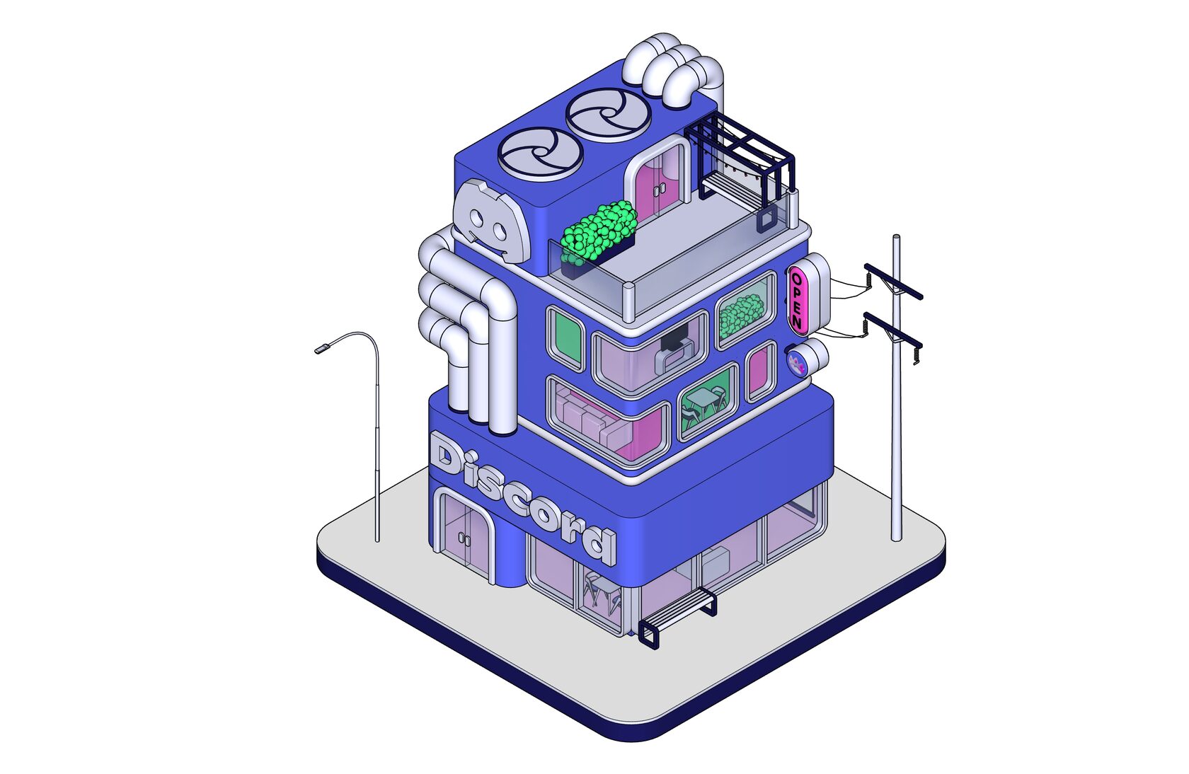
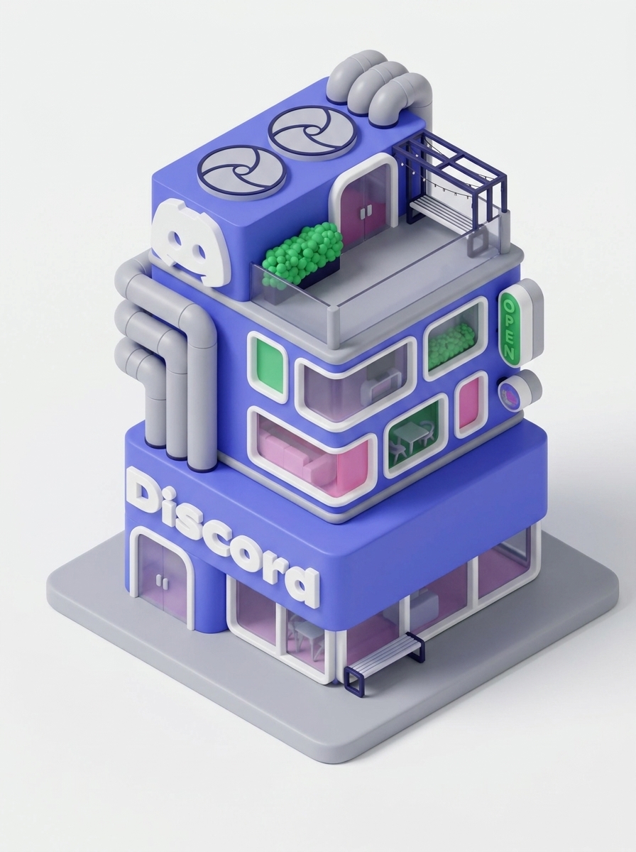
This is where I started. Clean SketchUp export, white background, flat render. Good geometry, accurate proportions, exactly what I built. Now let's see what five different AI tools do with it.
SketchUp's Own AI Render — Beautiful Background, Broken Details
Since I was already in SketchUp, I tried the built-in AI Render first. Included in the Pro subscription, uses credits, obvious first move.
SketchUp AI render result — dark cinematic image
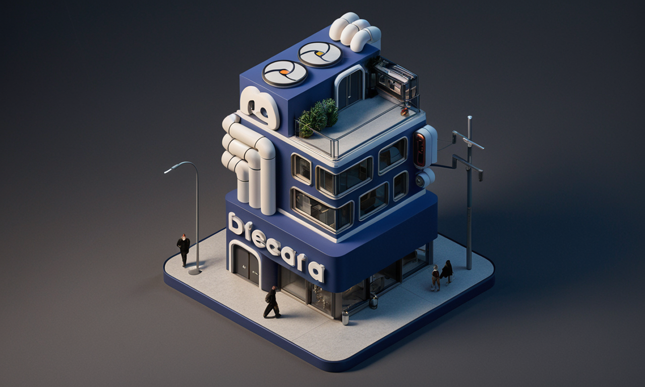
The background is genuinely stunning. Dark, moody, atmospheric — the kind of environmental lighting you'd want for a hero shot. If I were an architect presenting a building concept, I'd be happy with this.
But I'm not presenting a building concept. I'm presenting a brand asset.
Look closer and everything that matters to a graphic designer is gone. The Discord logo — destroyed. The "OPEN" sign — unreadable. The "Discord" lettering across the facade — completely scrambled. Every detail that carries brand identity, every piece of type, every specific graphic element — replaced by the AI's best guess at what a building "should" look like.
The background is good. The brand is gone. For architectural mood exploration, SketchUp AI Render has real potential. For brand-specific work where your logo and signage need to survive the render? Not there yet.
Adobe Firefly — Two Very Different Attempts
My first Firefly result was actually decent. The geometry held, the colors were close to Discord's blurple, and the building was clearly recognizable.
Firefly result 1

Not perfect — the surfaces felt a little flat and the pipes lost definition — but usable. Then I made the mistake of adding a style reference image. A Discord brand visual with their mascot, thinking it would help anchor the colors and mood.
It did not help.
Firefly result 2 — the NITRO one
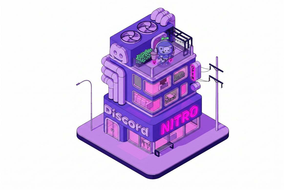
Firefly took the mascot from my reference image and merged it directly into my building. Added "NITRO" text across the facade. Shifted the entire color palette to purple-pink monochrome. My model was gone. What came back was Firefly's interpretation of "Discord" — not my geometry, not my design decisions, not my colors.
The lesson: Firefly reads style references very literally. It doesn't separate "borrow the mood from this image" from "use the actual content of this image." If your reference has a character in it, expect that character to show up in your render.
I ran out of credits before I could fix it.
Nano Banana (Gemini 3)
One attempt. Then the paywall.
Nano Banana result
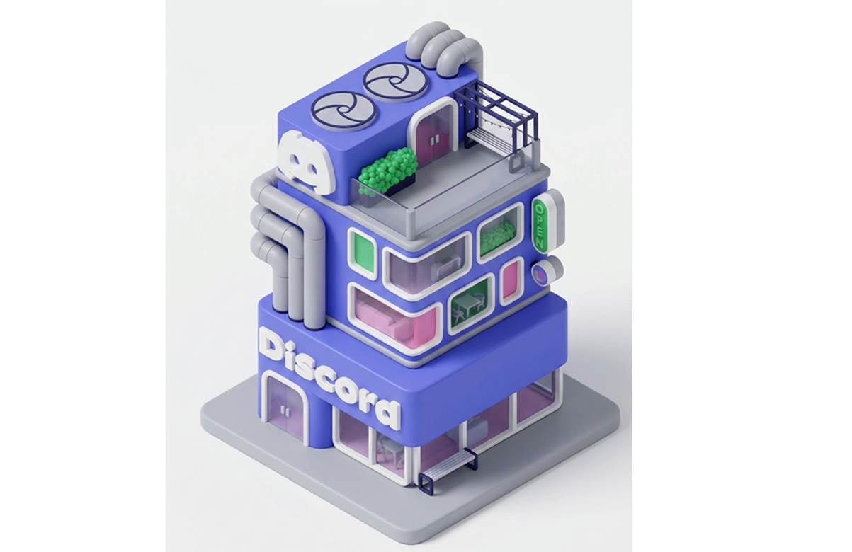
This is the most accurate render of the group. The geometry is the most faithful to my original model. The quality is genuinely impressive. The little signage on the side of the building changed both color and content, and the electrical post disappeared entirely — the AI quietly decided those details didn't belong in its version of the scene.
The problem is exactly that — one attempt is not enough to learn how to use any tool properly. Nano Banana's credit system burns fast, and without room to iterate, you're essentially paying to test rather than to produce.
The potential is clearly there. I just couldn't afford to find it.
LookX — Geometry Yes, Colors No. But 100 Free Credits.
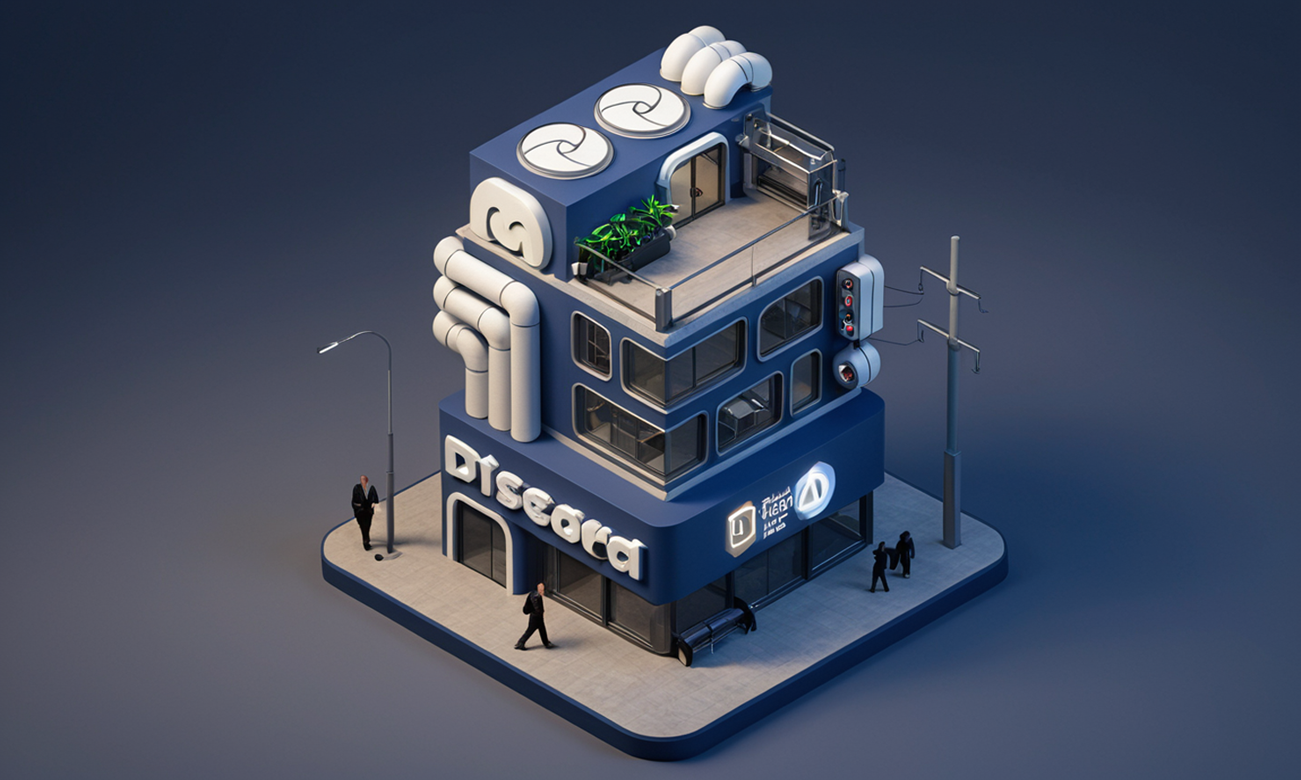
LookX results — both attempt


LookX surprised me in one specific way: the geometry held really well. The building proportions, the pipes, the window frames, the overall structure — all recognizable and accurate. That's not nothing. Most tools either nail the colors or nail the geometry. LookX got the geometry.
The colors, though, went somewhere I didn't ask them to go. The blurple shifted, the pink windows lost their punch, and the overall palette drifted away from Discord's brand. I'm honestly not sure yet whether that's a prompt problem or a tool limitation — this was only my second attempt with LookX, and I haven't had enough time to figure out the color controls properly.
What keeps me coming back to experiment: LookX gives 100 free credits to start. That's genuinely generous. It's enough room to actually learn the tool — to make mistakes, iterate, and figure out what works — without immediately hitting a paywall. That alone makes it worth exploring further.
The geometry accuracy is a real strength. If I can figure out the color controls, this tool could be interesting for this type of work. More testing needed.
ChatGPT Image
I'll be honest. By this point I was frustrated. I uploaded the screenshot, typed a prompt I wouldn't call carefully crafted, and hit generate.
ChatGPT day result
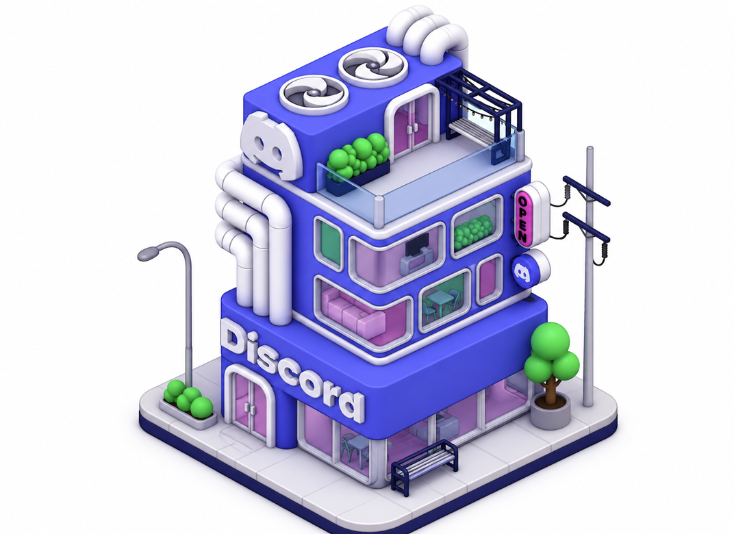
Clean. Sharp. Every detail from my original model present. The "Discord" text readable and correctly placed. No unexpected characters, no color drift, no strange additions. Then I asked for a night version.
ChatGPT night result
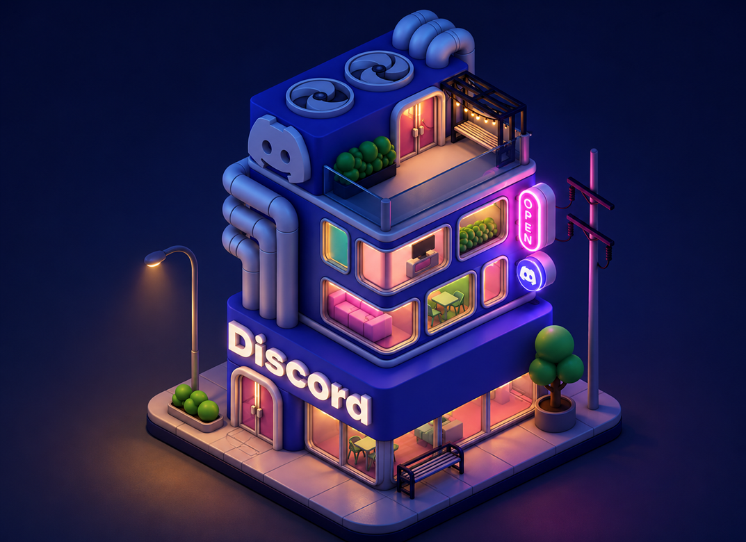
The neon glow from the windows, the street lamp, the OPEN sign lit up — this one crossed from "good render" into genuinely beautiful. The warmth is slightly more yellow than the cold blue-purple I'd ideally want, but for a result that took under two minutes and no credit anxiety, it's hard to argue with.
Two attempts. Two usable results. Zero drama.
The Thing I Didn't Expect to Figure Out Today
Here's the real finding — and it's more useful than any prompt tip I could give you.
Every AI rendering tool designed for SketchUp — Veras, Enscape, LookX, SketchUp's own built-in AI Render — is trained on physical reality. Real materials. Real light. Buildings that could actually be constructed and occupied. They are built for architects and interior designers who need their models to look like photographs of real spaces.
My model is not architecture. It's a graphic design asset that happens to exist in 3D. It's not trying to look real — it's trying to look like a brand.
That's a completely different goal. And it's why every "professional" rendering tool kept producing results that felt slightly wrong — too heavy, too literal, too much like an architect's portfolio. They were trying to apply physical light simulation to something that was never meant to obey physics.
ChatGPT and Nano Banana worked because they're generalist image models that understand illustration style, brand aesthetics, and visual design language. They don't care that my building would structurally collapse. They make it look good in the way a brand asset needs to look good — bold, clean, on-palette, and polished.
If you're a graphic designer using SketchUp for brand work — packaging visualization, 3D brand assets, environmental graphics, retail design concepts — stop reaching for the tools that promise photorealism. They were not built for what you're making. Start with tools that understand illustration and brand design. The results will be faster, better, and far less frustrating.
Where This Leaves Me
This experiment is not finished. I want to test Nano Banana properly with more than one attempt. I want to push the ChatGPT night render toward the cooler, bluer palette it should have. I'm still building the workflow.
But I'm publishing this now — unfinished, five images, one real insight — because I think an honest account of what I actually figured out is more useful to you than a polished tutorial I haven't fully earned yet.
See you next time,
Sanaz Vazirian
Architect, Graphic Designer, Educator
Founder — SketchUp for Graphic Designers
p.s. LookX AI Review
Sanaz Vazirian
Architect, Graphic Designer, Educator
Founder — SketchUp for Graphic Designers
p.s. LookX AI Review
In my classes, 90% of graphic designers get stuck with the same issue. I created a quick guide to explain it in Adobe language! Once you understand it, you will never make the same mistake.
GRAB YOURS HERE!