Estimated reading time: 6 minutes
Most graphic designers think environmental graphic design is about learning a new process. It isn't. It's about learning a new ruler.
As graphic designers, we've spent years designing on a 2D canvas. Whether it's a website, poster, brochure, or social media graphic, we instinctively judge proportion by comparing one element to another. Is the headline big enough? Is the logo balanced? Does the spacing feel right?
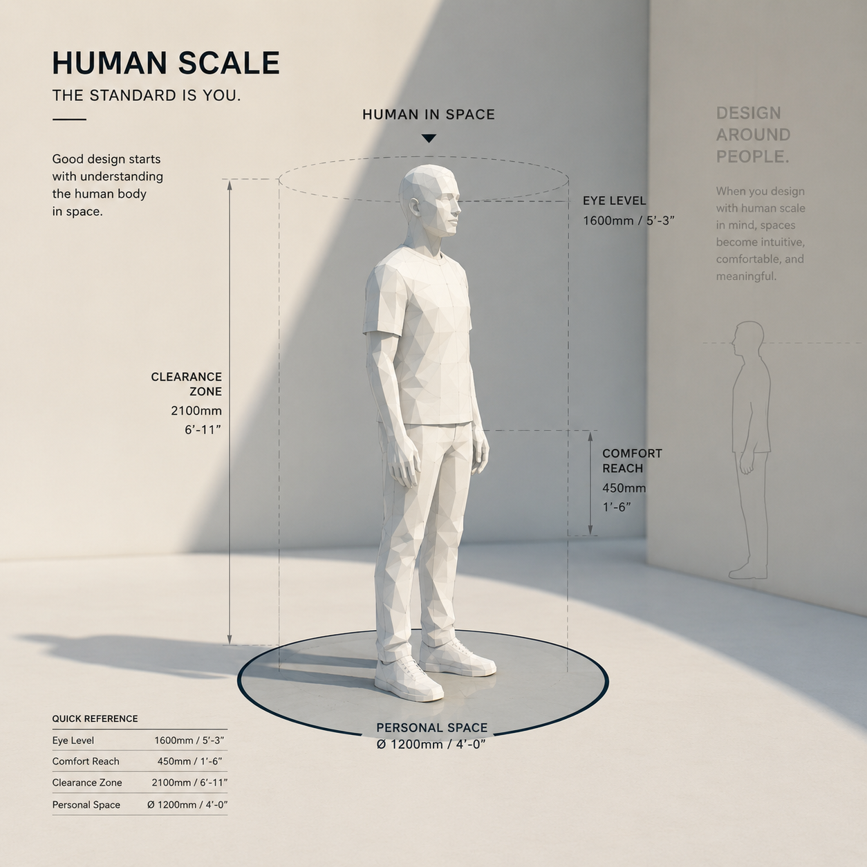
Those instincts are excellent. You don't need to unlearn them. You simply need to recalibrate them. Because in environmental graphic design, your canvas isn't a page anymore. It's a space. And the ruler you're designing against isn't the edge of the artboard. It's the human body. Once you make that mental shift, environmental graphic design starts making a lot more sense.
A Room Doesn't Read Like a Page
A page is experienced all at once. A space is experienced through movement. People walk into it. They turn corners. They look for directions. They browse. They stop. They continue walking.
That means your design isn't judged from one perfect viewpoint. It's experienced from dozens of different ones. In a 3D space, people define proportion. The sooner you start designing around people, the faster your environmental design skills will grow.
Your Body Is Already Teaching You
One of the fastest ways to become a better environmental designer has nothing to do with software. Start paying attention to your own body. The next time you're in a café, grocery store, airport, museum, hospital, or office, stop looking at the branding and start observing yourself.
Ask yourself:
You're no longer judging the design. You're experiencing the space exactly as your future users will. The world becomes your classroom.
Eye Level Is Your New Baseline
One principle alone will improve almost every project you design. Stop centering graphics on the walls. Start centering them on people.
Most adults naturally look around 1.5 m (5 ft) above the floor while walking. Think of that invisible horizontal line as the environmental equivalent of "above the fold" in web design. That's where your most important information wants to live.
Move it too high and people have to look up. Move it too low and they have to bend down. Every unnecessary movement creates friction. Good environmental graphic design makes finding information feel effortless.
Three SketchUp Habits That Will Change Your Designs
Learning SketchUp is important. Learning how to think inside SketchUp is even more important. These are three habits I recommend to every designer moving from graphic design into environmental graphic design.
1. Start Every Model With a Person
Before placing signs...before adding graphics...before worrying about materials...drop a scale figure into your model. Then draw a horizontal guide at approximately 1.5 m (5 ft) across the space. Instead of asking, "Does this look centered?" ask, "Would someone naturally notice this while walking?" It's a tiny habit that completely changes your sense of scale.
2. Walk Your Model
Most beginners orbit around their model like they're flying a drone. Real people don't experience spaces that way. Use SketchUp's Walk and Position Camera tools. Stand where a visitor would stand. Walk toward the reception desk. Turn the corner. Approach the sign.
Can you read it without trying? Does it appear at the right moment? Does it disappear too early? If it only works from a bird's-eye view, it probably won't work in real life.
3. Design for Distance, Not Zoom
Graphic designers naturally zoom in. Environmental designers constantly think about viewing distance. How far away will someone first see this sign? 20 feet? 40 feet? 60 feet?
A simple industry rule of thumb is that 1 inch of letter height is readable from approximately 10 feet away. If your audience first sees a sign from 40 feet away, your letters should be around 4 inches tall. Beautiful typography means nothing if nobody can read it. Distance—not your monitor—determines scale.
The Mindset Shift That Changes Everything
Environmental graphic design isn't about making graphics bigger. It isn't about filling walls. And it isn't about learning another piece of software. It's about understanding how people experience space.
You already know hierarchy. You already know composition. You already know typography. Now, add one more principle: Design for the body first.
Use the room as your canvas. Use the human body as your ruler. Then use SketchUp to test those ideas before they're built. That's when SketchUp becomes more than a modelling tool. It becomes a way to experience your design from a human perspective long before construction begins. And once you start thinking this way, you'll never look at a room—or your SketchUp models—the same way again.
Most graphic designers think environmental graphic design is about learning a new process. It isn't. It's about learning a new ruler.
As graphic designers, we've spent years designing on a 2D canvas. Whether it's a website, poster, brochure, or social media graphic, we instinctively judge proportion by comparing one element to another. Is the headline big enough? Is the logo balanced? Does the spacing feel right?
Those instincts are excellent. You don't need to unlearn them. You simply need to recalibrate them. Because in environmental graphic design, your canvas isn't a page anymore. It's a space. And the ruler you're designing against isn't the edge of the artboard. It's the human body. Once you make that mental shift, environmental graphic design starts making a lot more sense.
A Room Doesn't Read Like a Page
A page is experienced all at once. A space is experienced through movement. People walk into it. They turn corners. They look for directions. They browse. They stop. They continue walking.
That means your design isn't judged from one perfect viewpoint. It's experienced from dozens of different ones. In a 3D space, people define proportion. The sooner you start designing around people, the faster your environmental design skills will grow.
Your Body Is Already Teaching You
One of the fastest ways to become a better environmental designer has nothing to do with software. Start paying attention to your own body. The next time you're in a café, grocery store, airport, museum, hospital, or office, stop looking at the branding and start observing yourself.
Ask yourself:
- Where did my eyes naturally land first?
- What information was impossible to miss?
- What information did I completely overlook?
- Did I have to look up, bend down, or stop walking to read something?
- What felt effortless, and what created friction?
You're no longer judging the design. You're experiencing the space exactly as your future users will. The world becomes your classroom.
Eye Level Is Your New Baseline
One principle alone will improve almost every project you design. Stop centering graphics on the walls. Start centering them on people.
Most adults naturally look around 1.5 m (5 ft) above the floor while walking. Think of that invisible horizontal line as the environmental equivalent of "above the fold" in web design. That's where your most important information wants to live.
Move it too high and people have to look up. Move it too low and they have to bend down. Every unnecessary movement creates friction. Good environmental graphic design makes finding information feel effortless.
Three SketchUp Habits That Will Change Your Designs
Learning SketchUp is important. Learning how to think inside SketchUp is even more important. These are three habits I recommend to every designer moving from graphic design into environmental graphic design.
1. Start Every Model With a Person
Before placing signs...before adding graphics...before worrying about materials...drop a scale figure into your model. Then draw a horizontal guide at approximately 1.5 m (5 ft) across the space. Instead of asking, "Does this look centered?" ask, "Would someone naturally notice this while walking?" It's a tiny habit that completely changes your sense of scale.
2. Walk Your Model
Most beginners orbit around their model like they're flying a drone. Real people don't experience spaces that way. Use SketchUp's Walk and Position Camera tools. Stand where a visitor would stand. Walk toward the reception desk. Turn the corner. Approach the sign.
Can you read it without trying? Does it appear at the right moment? Does it disappear too early? If it only works from a bird's-eye view, it probably won't work in real life.
3. Design for Distance, Not Zoom
Graphic designers naturally zoom in. Environmental designers constantly think about viewing distance. How far away will someone first see this sign? 20 feet? 40 feet? 60 feet?
A simple industry rule of thumb is that 1 inch of letter height is readable from approximately 10 feet away. If your audience first sees a sign from 40 feet away, your letters should be around 4 inches tall. Beautiful typography means nothing if nobody can read it. Distance—not your monitor—determines scale.
The Mindset Shift That Changes Everything
Environmental graphic design isn't about making graphics bigger. It isn't about filling walls. And it isn't about learning another piece of software. It's about understanding how people experience space.
You already know hierarchy. You already know composition. You already know typography. Now, add one more principle: Design for the body first.
Use the room as your canvas. Use the human body as your ruler. Then use SketchUp to test those ideas before they're built. That's when SketchUp becomes more than a modelling tool. It becomes a way to experience your design from a human perspective long before construction begins. And once you start thinking this way, you'll never look at a room—or your SketchUp models—the same way again.